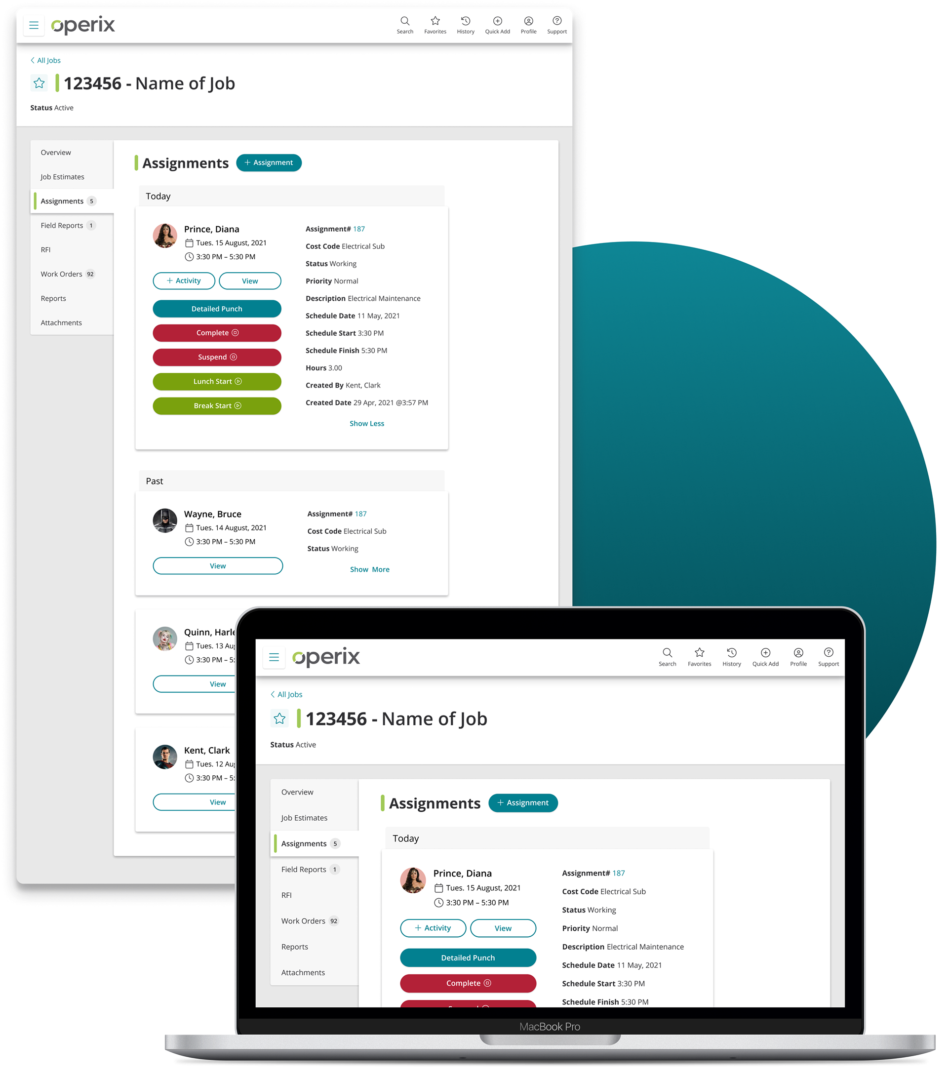
Helping Technicians Punch in Time

The Project
Company
Operix
Operix
Role
Lead UX/UI Designer
Lead UX/UI Designer
Users
Supervisors on a job site and construction workers who need to check assignment details and clock in.
Supervisors on a job site and construction workers who need to check assignment details and clock in.
Users
• Sketchbook and pencils for rough wireframes
• Figma for building low-fi and high-fi mockups
• Sketchbook and pencils for rough wireframes
• Figma for building low-fi and high-fi mockups
Problems
• Previous Job Assignment pages used outdated UI that had many inconsistencies and accessibility issues.
• The hierarchy of information wasn’t organized clearly or logically displayed.
• Punch action buttons had a dual function for detailed punches that wasn’t readily apparent.
• On mobile, buttons were sometimes too small and close together for our users who tend to need larger tap targets.
Challenges
• Limited time and resources to conduct thorough iterative testing directly with users.
• Limited time and resources to conduct thorough iterative testing directly with users.
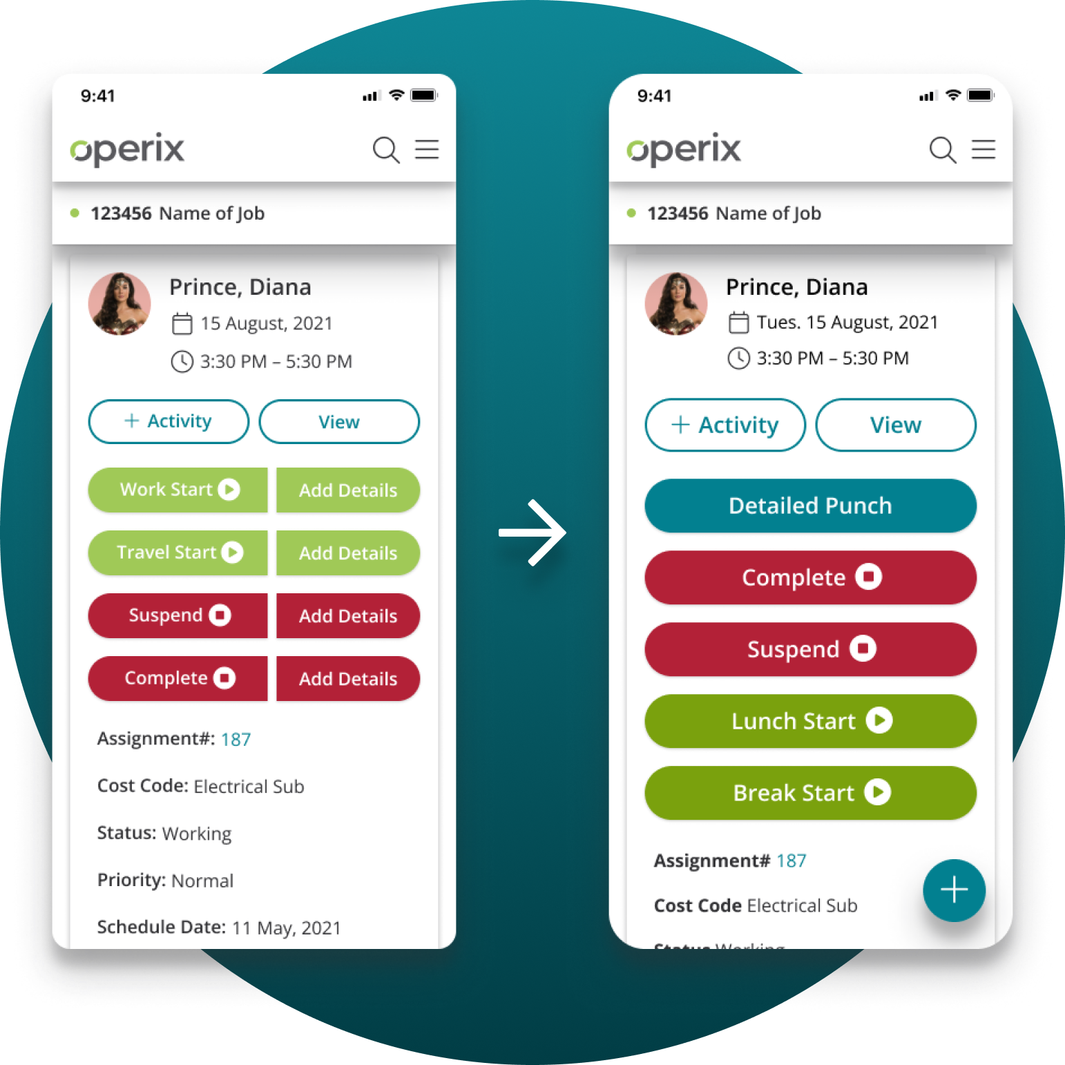
The image shows the previous version of punch actions on tablet and mobile before the redesign.
Process
• Relied on user feedback relayed by Customer Support and information obtained from previous interviews.
• Iterated based on feedback from Customer Support and Subject Matter Experts within Operix.
• Followed an iterative process from sketches up to high-fidelity mockups.
• Implemented new UI components and styles into mockups which I designed to be accessible, easy to use, and give an updated look and feel to the product.
• Created high-fidelity mockups and ensured that designs worked across multiple sizes and devices from small mobile screens to large desktop monitors.
Some of the changes made: buttons were made larger to increase click accuracy, different green was used to be more visually accessible, and Details were put into one button instead of separate ones to clean up the page and action overload.
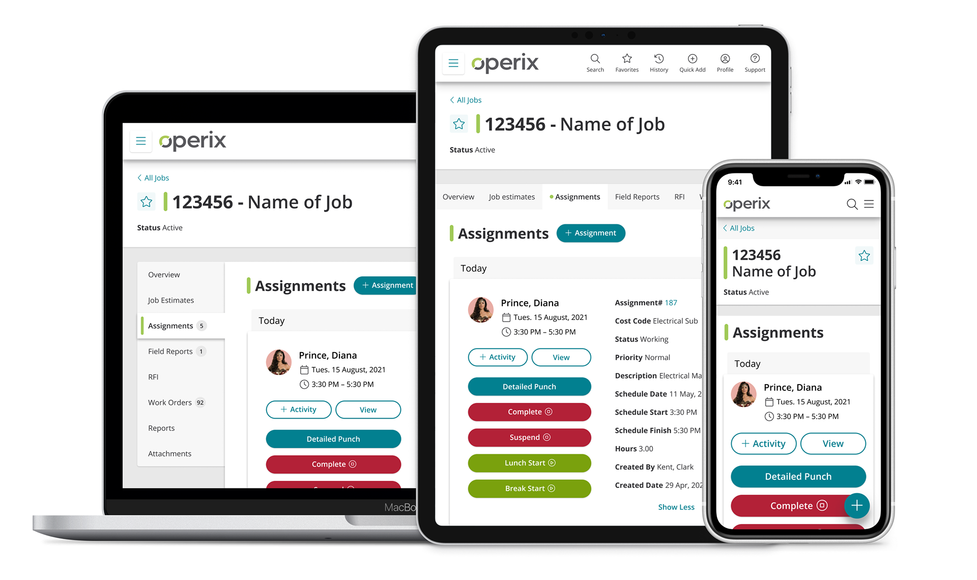
Responsive Design Across Devices
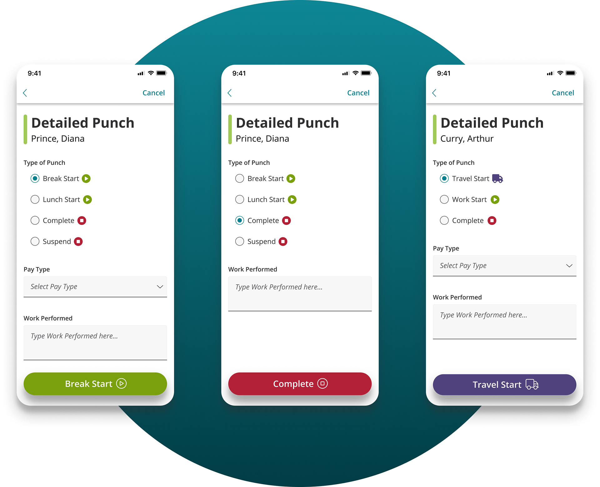
Screens for Detailed Punch Actions
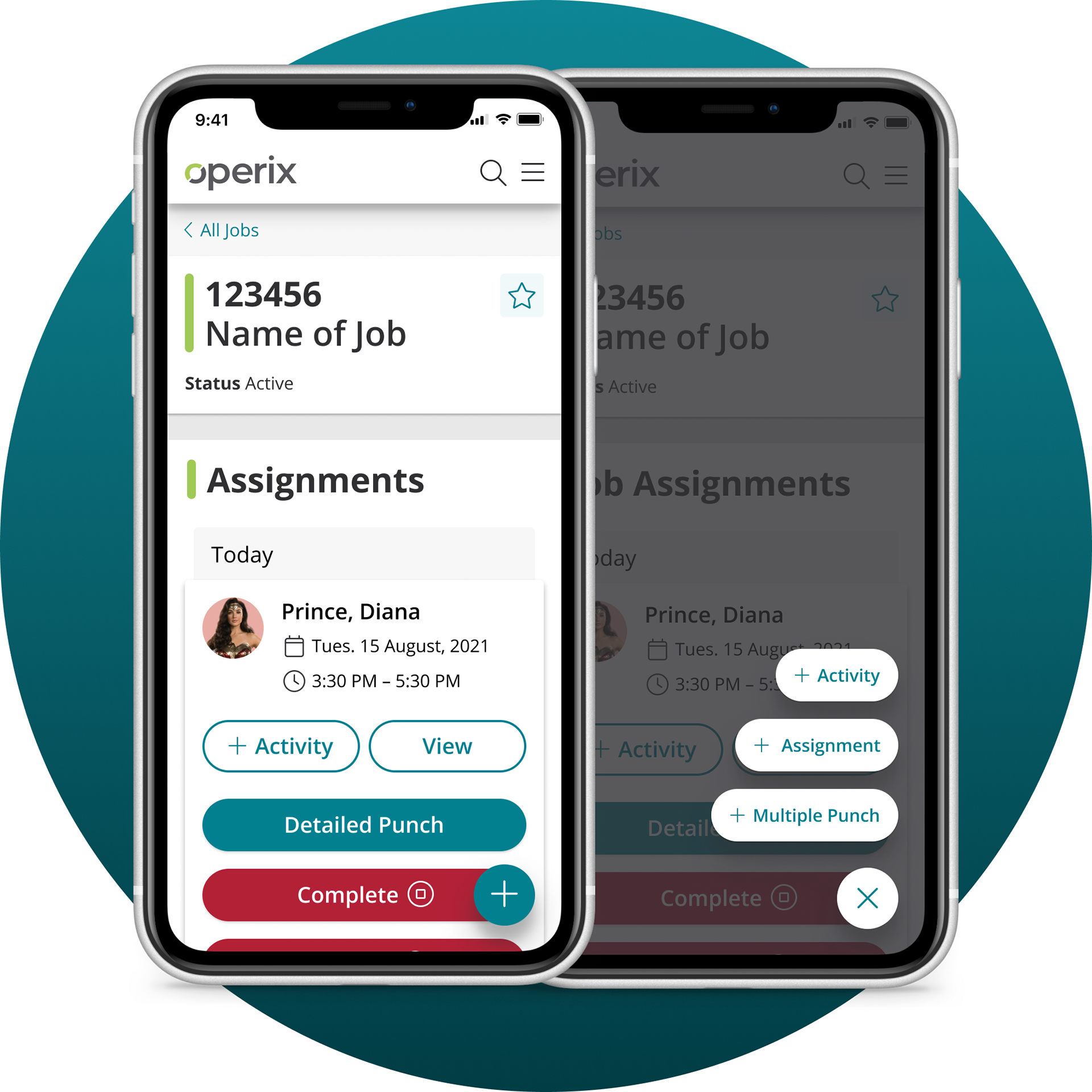
Floating Action Buttons
Tablet Design
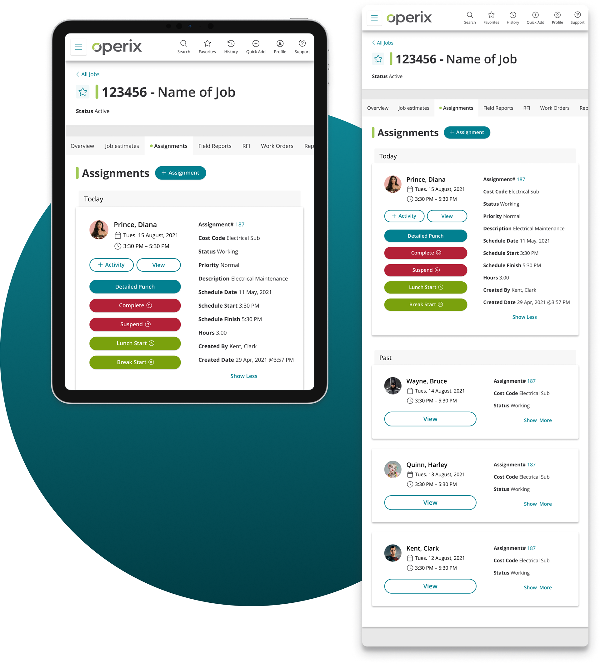
Desktop Design